
Sisterlocks By D
Sisterlock by D, a hair management service, was envisioned and brought to life by the visionary Diana Higgins. Recognising the importance of a strong visual identity for her brand, Diana sought comprehensive logo and graphic design services to establish a distinctive and memorable presence in the market before the official launch of her business.


In collaborating on this project, the goal was not just to create a logo but to craft a visual representation that encapsulated the essence and uniqueness of Sisterlock by D. The design process involved understanding the core values of the brand, the specific services offered, and the overall aesthetic Diana envisioned for her business.
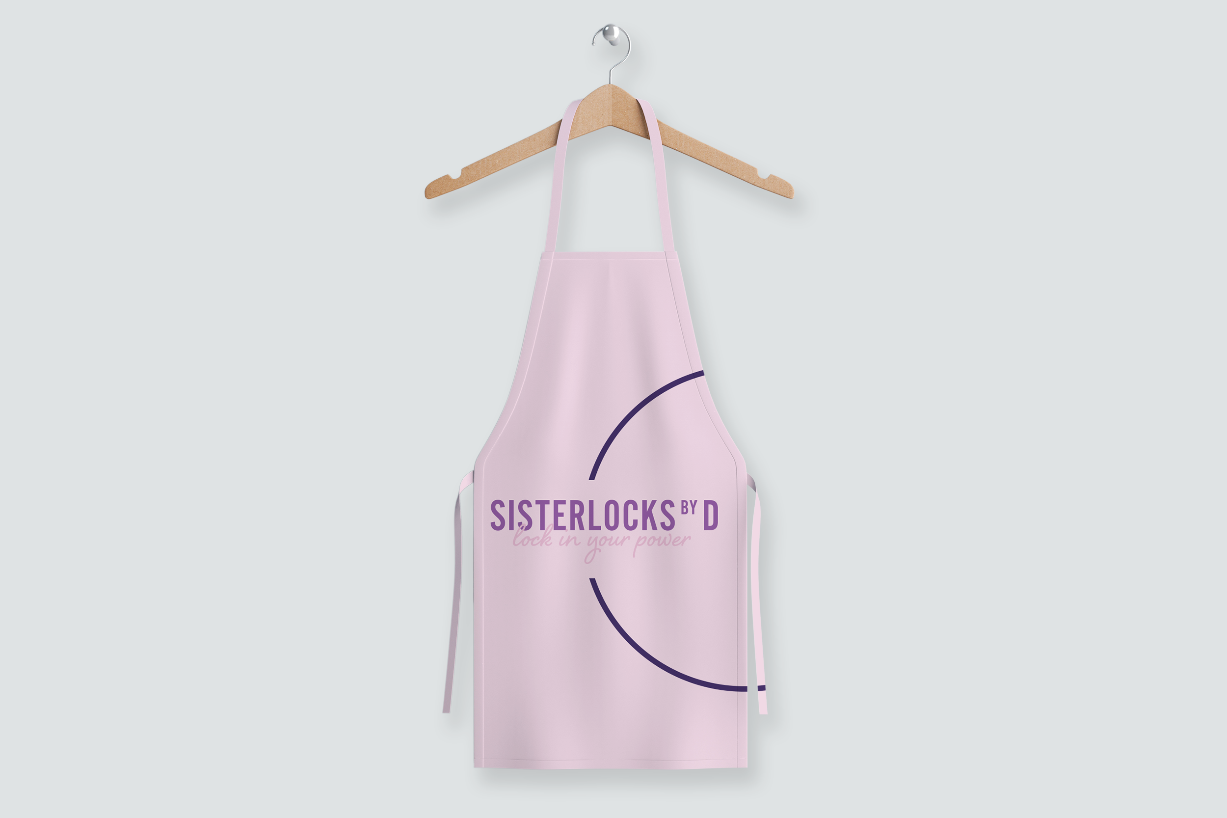
The resulting logo became a symbol of the meticulous hair care and management services Sisterlock by D provides. Careful consideration was given to typography, colour scheme, and graphical elements to ensure that the logo resonated with the target audience and communicated a sense of professionalism, expertise, and trustworthiness.


Client Feedback
“What can I say about Monique! Having heard good things about Monique's professionalism and ability to tap into your needs, I was excited to work with her and was not disappointed. I wasn't quite sure what I wanted but Monique, through a brief conversation was able to bring my thoughts to life. She seemed to truly understand the most important aspects for me by listening, questioning and providing suggestions. Monique is the creative talent you have been searching for! If you are looking for someone who can bring originality, positive energy, and effective communication in a design project, Monique is your person. Her professionalism and skills are exceptional.”
— Diana Higgins, CEO