

Spin Powered by Ladbrokes
Welcome to the dynamic world of Spin, the vibrant new adult gaming centre under the umbrella of Ladbrokes, an international sports betting and gambling company. Designed specifically to appeal to a younger audience, Spin demanded a fresh approach in both aesthetics and branding. As the Senior Designer at the helm of this exciting venture, I led the charge in crafting a visual identity that would resonate with our target demographic.


The journey began with a comprehensive competitor analysis, understanding the landscape to carve out Spin's unique place. From there, mood-boarding sessions set the tone, exploring an array of colours, typography styles, and visual elements that would define the brand's personality.
Conceptualisation was the heart of the project, where ideas took shape and evolved. Collaborating closely with the Junior Designer, we refined these concepts into a cohesive visual design that breathed life into Spin's identity. Every detail, from the logo to the marketing materials, was meticulously crafted to speak the language of the younger audience we aimed to captivate.
Presentations to stakeholders were a crucial phase, where the vision for Spin was unveiled and refined. Feedback sessions became an integral part of the process, ensuring that every design element resonated with the brand's ethos and objectives.


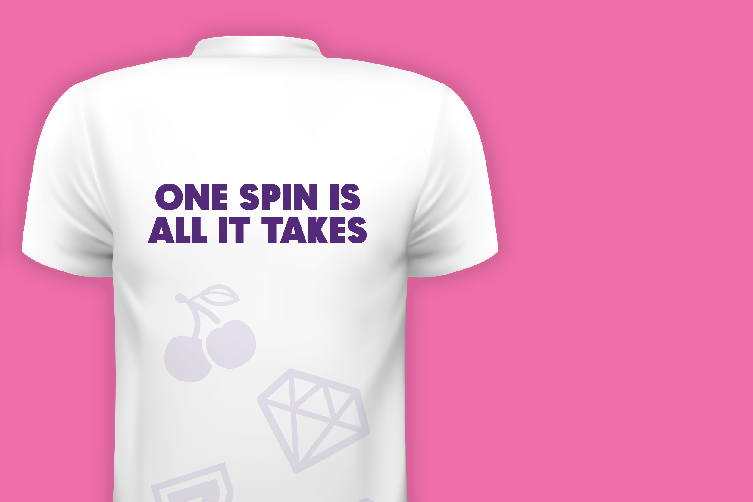
The result? A vibrant and engaging brand experience, where colours popped with youthful energy, and typography danced with a sense of playfulness. Spin's brand guidelines became the roadmap for consistency, ensuring that every touchpoint, from digital screens to in-house promotions, carried the essence of the brand.