
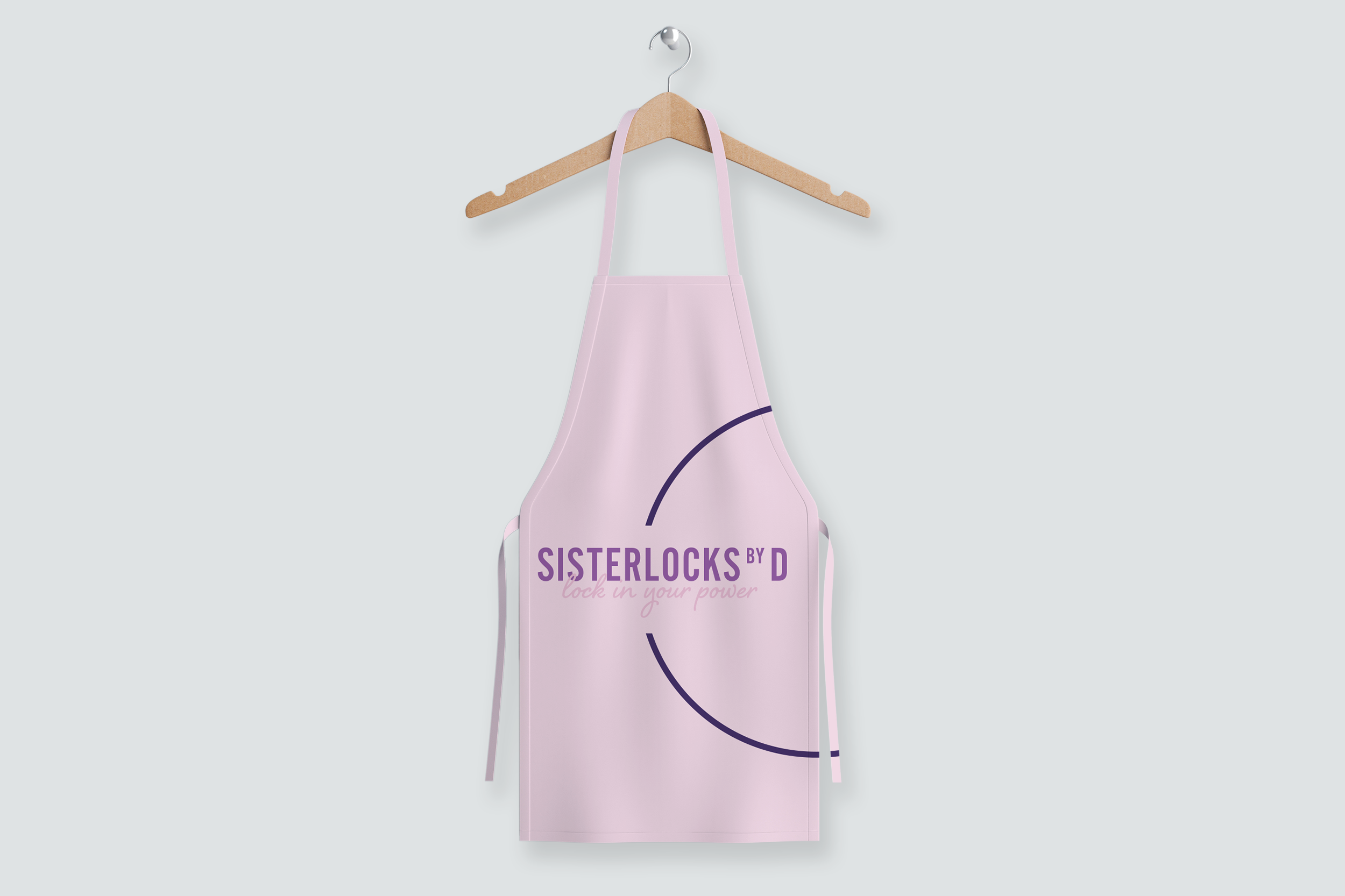
Sisterlocks By D
Sisterlocks by D is a haircare service founded by Diana Higgins, specialising in the unique artistry of Sisterlocks. Diana needed a brand identity that would feel polished, professional, and trustworthy ahead of her launch.
We kicked off by mapping out what made her service unique: precision, care, and empowerment. With that in mind, I designed a clean, modern logo that reflected both expertise and style. The typography was carefully selected to feel elegant but approachable, while the colour palette brought a sense of calm and sophistication.
The final identity gave Diana the confidence to launch her business with a clear visual voice, knowing it will work across everything from social media to service collateral, helping her attract the right clients and establish a strong, credible presence from day one.


Client Feedback
“What can I say about Monique! Having heard good things about Monique's professionalism and ability to tap into your needs, I was excited to work with her and was not disappointed. I wasn't quite sure what I wanted but Monique, through a brief conversation was able to bring my thoughts to life. She seemed to truly understand the most important aspects for me by listening, questioning and providing suggestions. Monique is the creative talent you have been searching for! If you are looking for someone who can bring originality, positive energy, and effective communication in a design project, Monique is your person. Her professionalism and skills are exceptional.”
— Diana Higgins, CEO