

Eurostar
When two companies become one, people need more than a new logo. They need a shared sense of identity. Vitalité was created to bring together Eurostar's wellbeing initiatives under one clear, engaging and recognisable brand that employees across multiple countries could connect with.
Following the merger of Eurostar and Thalys, the business had two separate wellbeing programmes operating under different names. This created confusion and made it harder to communicate the support available to employees.
The objective was to create a single wellbeing brand that felt inclusive, positive and relevant across the wider Eurostar Group while encouraging greater awareness and engagement with wellbeing initiatives.
-
Brand Identity
Creative Direction
Visual Design
Internal Communications
-
Travel & Transport
-
Design Team Manager


My Approach
I started by exploring how wellbeing was already being communicated across the business and identifying opportunities to create something more memorable and cohesive.
The name Vitalité was chosen to represent energy, health and positivity. I wanted the visual identity to feel optimistic and human while remaining distinctly Eurostar.
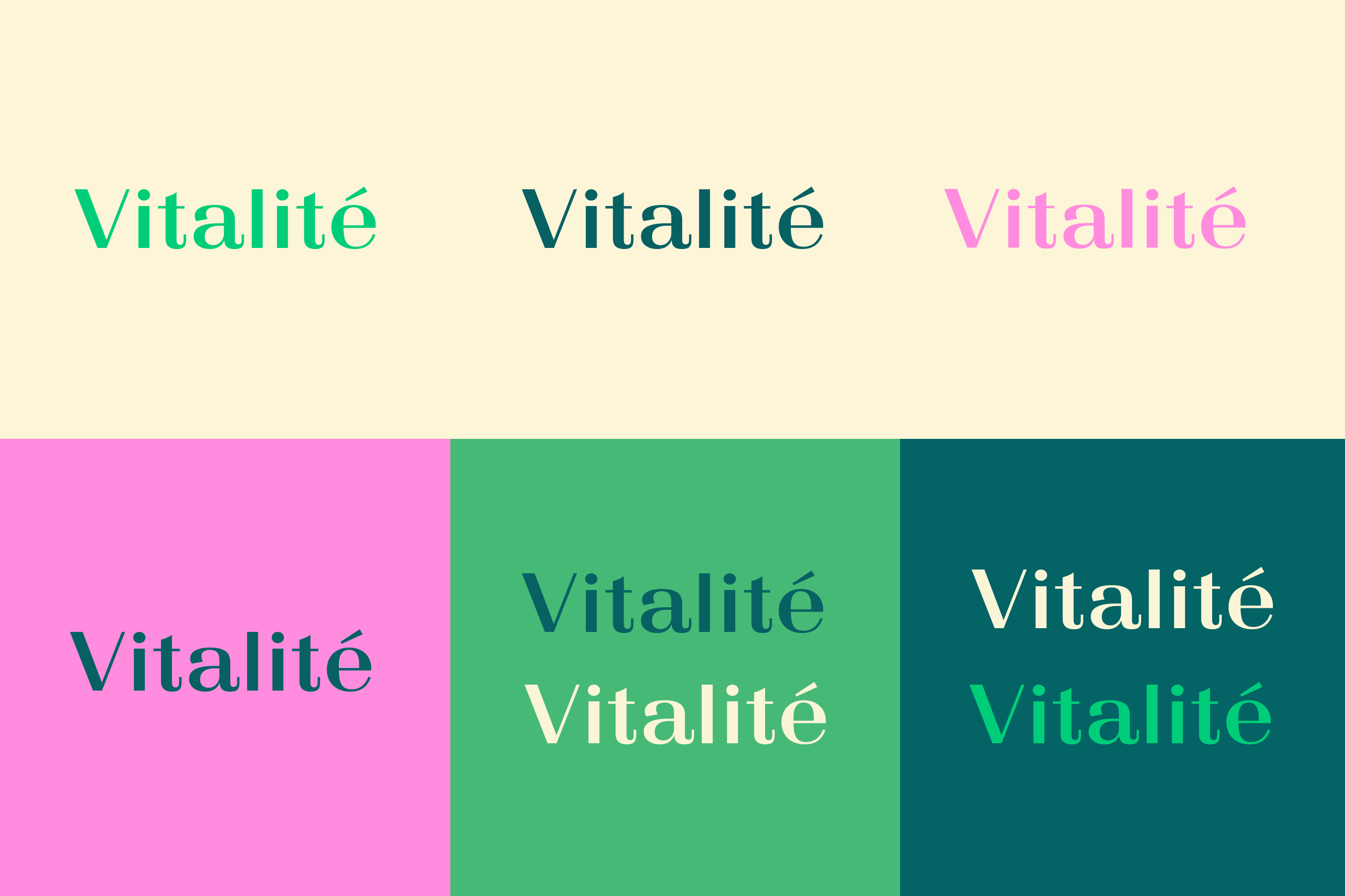
Rather than relying on the most commonly used brand colours, I explored some of the more expressive colours within the Eurostar palette. This helped the identity stand apart from operational and customer facing communications while still feeling connected to the wider brand.
Bringing It To Life
I developed several creative routes and presented concepts to stakeholders before refining the preferred direction.
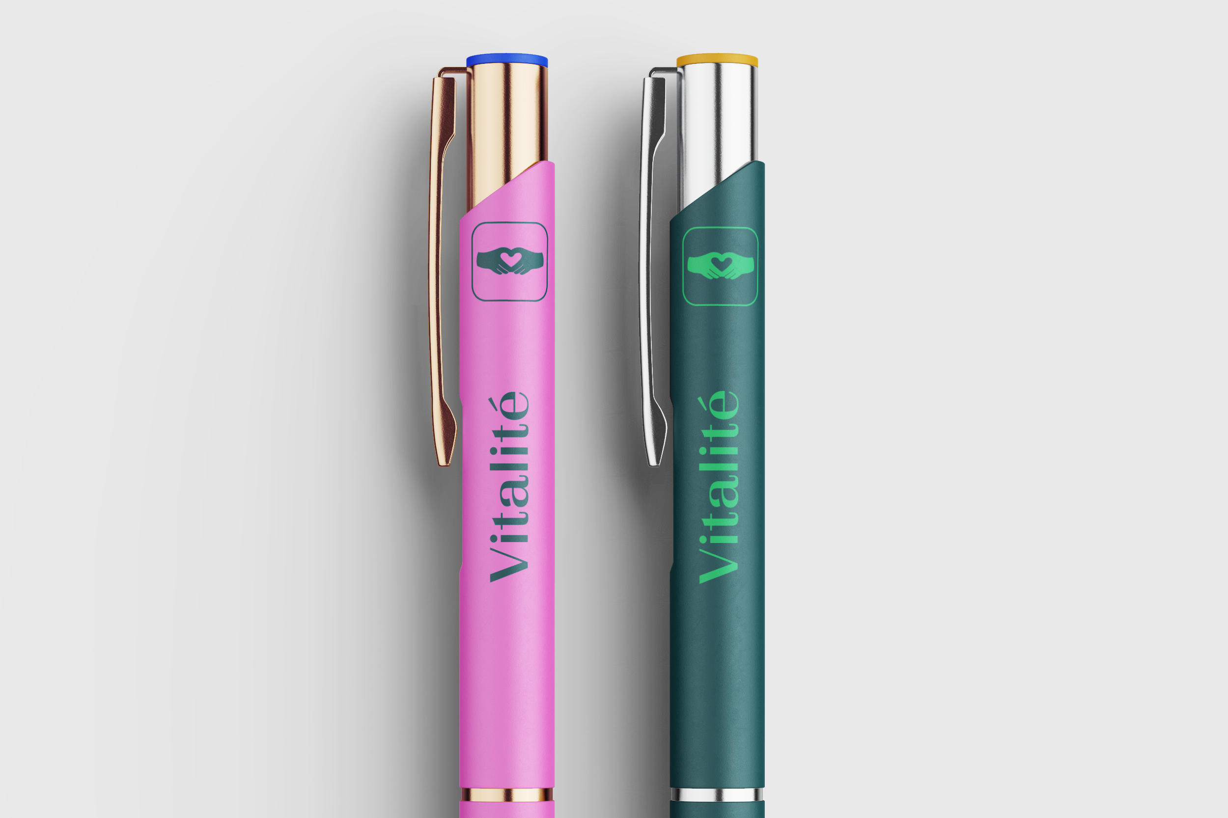
Working closely with a specialist illustrator, we created a bespoke icon featuring a hand forming a heart shape. The symbol represents care, mental wellbeing and physical wellbeing while giving the programme a distinctive visual asset that could work across multiple applications.
The final identity combined vibrant colours, accessible colour pairings and a flexible design system that could be used across digital communications, campaigns, events and internal resources.
Impact
Vitalité provided a clear and recognisable identity for wellbeing across the Eurostar brand.
The new brand improved visibility of wellbeing initiatives, created a stronger sense of consistency across regions and helped employees better understand the support available to them. Most importantly, it transformed wellbeing communications from something functional into something people could actively engage with.


